Block Settings
The flow block inspector is where you change a flow block's settings. This is also where you link blocks to each other.
Block name
Select the pencil next to the block name to change the block's name:
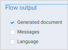
Flow output
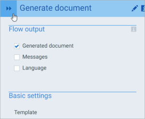
Everything that's enabled under flow output will be presented in the flow's output. For instance:
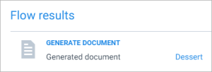
This means that the end user will see a link to the generated document at the end of the flow run:
Block parameters
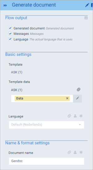
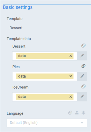
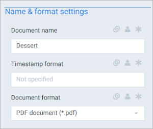
Every block has parameters that you can change - these are logically grouped together in sections. For instance, the Generate document block has 2 parameter sections:
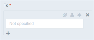
Most parameters are just one input field, such as the template to use in a Generate document step. But some can contain more than one field, such as the To parameter in the Send e-mail block:
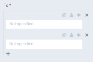
Notice the + under the parameter field. Select it to add another To address:
This way, you can use more than one e-mail address for the To parameter.
Select the X next to a field to delete that field.
Making parameter fields user editable and/or required
Most parameter fields come with 3 icons:
To activate an icon, select it to make it dark grey, which means it's activated.
The  icon is used to make this parameter field user editable. This means that the user executing the flow can change the value of this field when he/she runs this flow. For instance:
End user view:
If a parameter field is user editable, the default value of that field is whatever is put in it in the flow builder.
The  icon is used to make this parameter field required. This means that the user executing the flow must provide a value before he/she can continue with the flow. If you make a parameter field required, it automatically becomes user editable as well - it wouldn't make sense to make a field required if the user can't do anything about it.
Providing the end user with pre-defined options
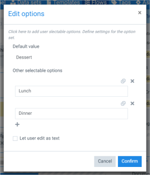
In addition to making a field user editable and thus letting the end user decide which value they want, you can select the user button next to the field to bring up Edit options:
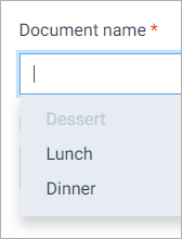
In here, you can provide additional values the end user can choose from. For instance, this screenshot will give the end user 3 options: Dessert, Lunch and Dinner, of which Dessert is the default option. Like so:
The icon changes to blue to show that there are user alternatives defined:
Enabling Let user edit as text will give the end user the possibility to edit the value without having to choose one of the provided options.
Collapsing the inspector
If you're ever tired of looking at the inspector, you can collapse it using the arrows:
This saves some space on the flow builder canvas. Select the arrows again to expand the inspector.
You can also drag the inspector to make it smaller/wider.
